Responses by Justin Huguet, producer and strategist, People People.
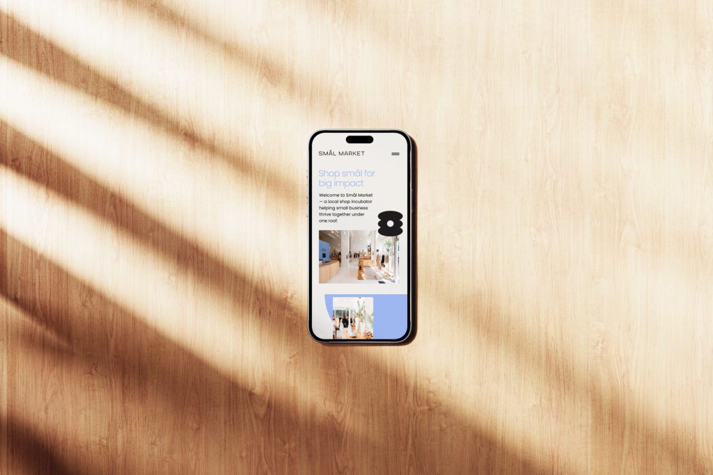
Background: In today’s era of skyrocketing rents and one-click shopping, how does a small retail business get its foot in the door—let alone thrive—in 2025? Ballard Alliance, a nonprofit organization dedicated to supporting the vitality of Seattle’s Ballard neighborhood, just took this challenge head on with the grand opening of Smål Market, a new merchant’s collective and local shop incubator. The market’s vision is to help small businesses establish their first brick-and-mortar stores while creating a vibrant shopping experience for Seattleites who value local and handmade goods. The initiative provides affordable shared retail space in a premier location, plus communal resources such as dedicated support staff and ongoing business education programming.
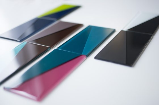
Design thinking: We were tapped to help with the naming, branding and visual execution of the new retail space. Our team sought out a creative name that was at once memorable, uniquely Ballard and succinctly shared the story of small shops thriving together under one roof. As such, the project’s name and identity draw heavily from Ballard’s roots as a Scandinavian fishing village—a theme that’s woven throughout the neighborhood’s DNA. The name Smål (meaning “small”) represents the small businesses, while Market underscores the communal setting and prime Market Street location. Smål Market’s visual aesthetic takes cues from timeless, understated Scandinavian design. Specifically, the wordmark features a modern sans serif typeface with bold angles, and a core color palette of charcoal, cream, clay and periwinkle anchors the brand with tasteful sophistication.
Challenges: As a shopping destination hosting six unique stores, each with their own unique look and feel, the challenge of designing Smål Market’s brand was to visually unite all of the shops while letting the distinct business identities shine independently. The end result is a simple yet inviting “umbrella brand” that welcomes shoppers and distinct businesses under one roof without being overly dominant, loud or distracting.
Favorite details: As part of Smål Market’s brand kit, we designed a collection of custom abstract geometric shapes to be used as supporting graphics. They can be stacked and arranged in myriad formations, creating unique patterns and new compound shapes. We took this one step further, creating additional shapes similar to the letters S, M, A and L, forming an ownable brand mark to pair with the full name. The S-M-A-L icon is a fun “aha” moment for people when they initially discover that the shapes spell out the name.
New lessons: In researching Scandinavian words we learned the character “å” includes a diacritic mark commonly called a “ring” or “ring above.” We loved the word play of the name Smål Market and how the ring accent gave it an immediately recognizable Scandi flair. The name is both descriptive and creative at the same time—a balance that’s often hard to strike.
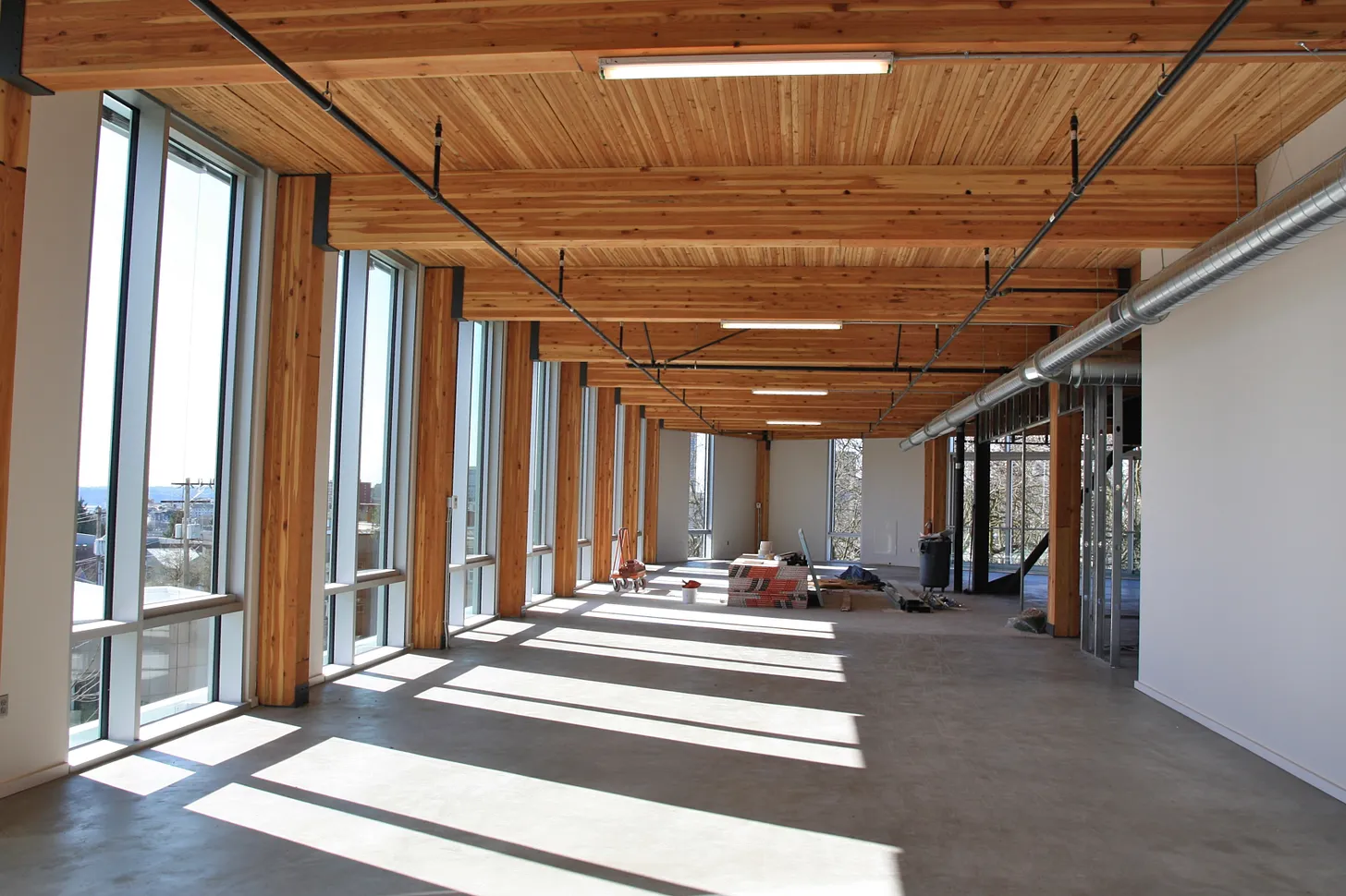
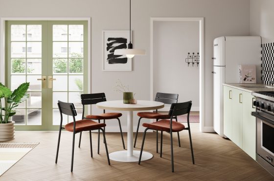
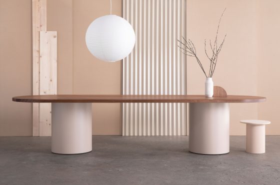
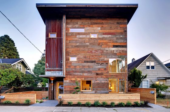
Visual influences: In collaboration with the Ballard Alliance team we set the interior design aesthetic for Smål Market. Through team brainstorms, space walkthroughs, mood boards, signage and interior mock-ups, we supported an overall vision for Smål Market’s minimalist and natural Scandinavian look, specifically drawing inspiration from bright and modern retail shops found in Copenhagen.