Sometimes finding the right house is less about careful preparation, and more a matter of embracing happy accidents. Such was the case for Paul Midgen and Kirsten Adams, after they moved with their daughter, Lark, back to Seattle from Amsterdam in 2018. “We had a Goldilocks problem,” says Paul. “First we bought a house and it was too big. Then we bought a second house and it was too small.” The couple looked into remodeling the latter, but the Covid-19 pandemic brought plans to a halt.
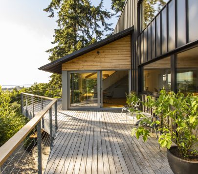
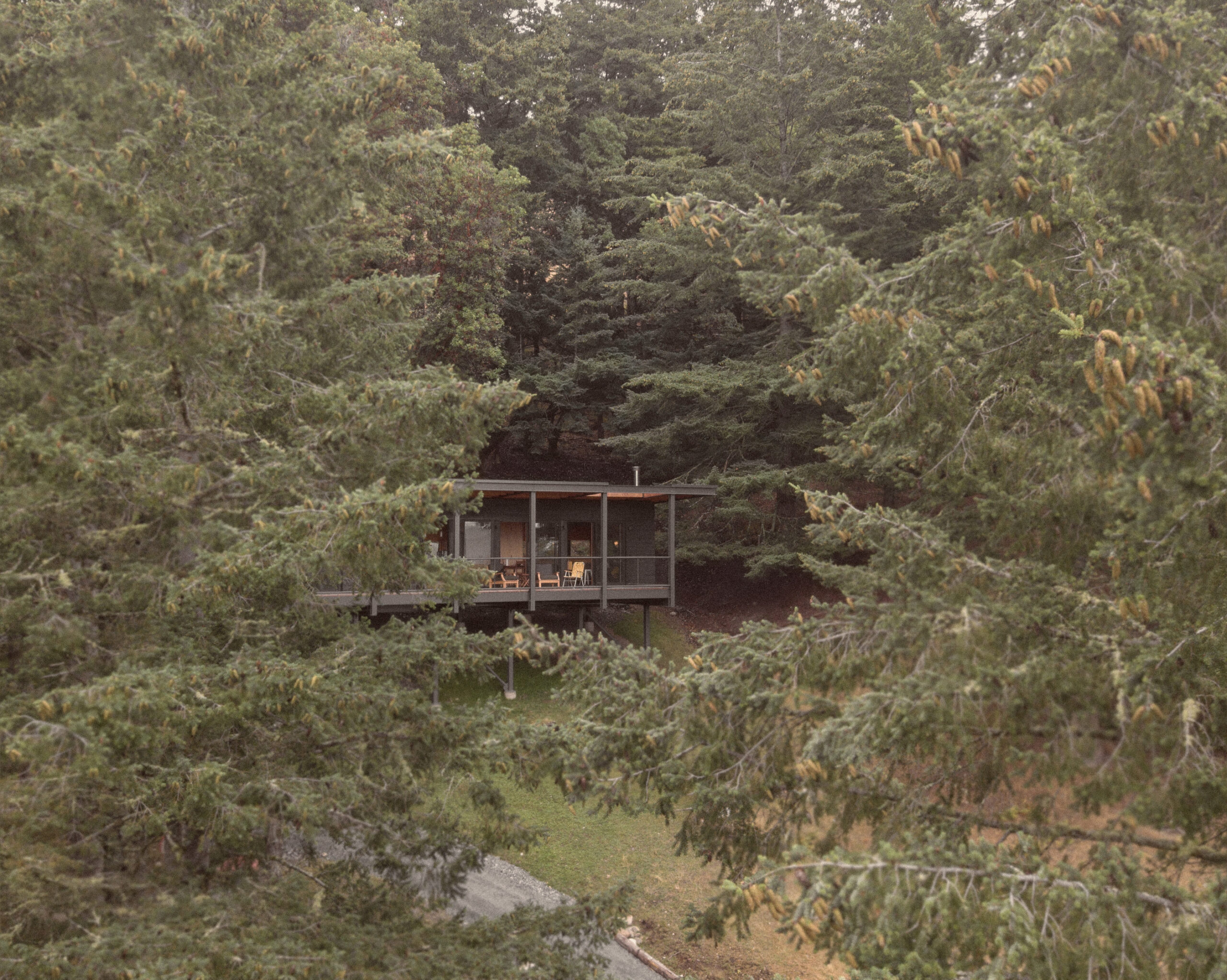
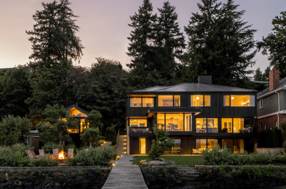
Then Paul developed what he calls, “a really bad Zillow habit.” It was in just one of those digital detours that he came across the listing for a 1958 midcentury in West Seattle designed by notable local architect Al Bumgardner. It was the right size, and aspects of it, like the floor-to-ceiling windows capturing views of Vashon Island, the Olympic Mountains, and Puget Sound, reminded Paul of his dream house, as seen in the background of episodes in the Battlestar Galactica reboot. “I remember thinking, I’ll be a lucky guy if I can ever have a place like that,” says Paul. “And that’s one of the first things I thought of when I saw this place.”
After months of “stalking” the listing, the price dropped enough so the couple could visit. What they saw was better than expected. “When I walked in, there was a giant window that looks out onto the Sound,” remembers Kirsten. “It felt like you were up in the sky, looking out at trees and nature. You just pinch yourself.” Still, the house would need updates, from the cramped bathrooms, to the pink granite in the kitchen and the peek-a-boo living room fireplace that looked into their bedroom. They promptly reached out to SHED Architecture & Design, admiring the firm’s approach to remodeling classic PNW midcentury homes.
For SHED, remodels like this are a matter of balancing preservation with thoughtful modifications and additions. “When you’re dealing with a historically significant house by a well-known architect, there’s always a challenge of making sure that you’re not being insensitive,” says Kyle Keirsey, project designer at SHED, who worked alongside Thomas Schaer, principal at SHED. “It’s really just thinking, how would Bumgardner approach this design today? How do we dovetail our clients’ personal identities and requirements into this house?” SHED and the homeowners were joined by contractor Ambrose Construction for the best results. “It’s always a challenge to blend in the new and try to make it as though you weren’t there,” says contractor Brad Wageman. “That’s always what we’re after with our work, whether we’re in a traditional house or a midcentury like this.”
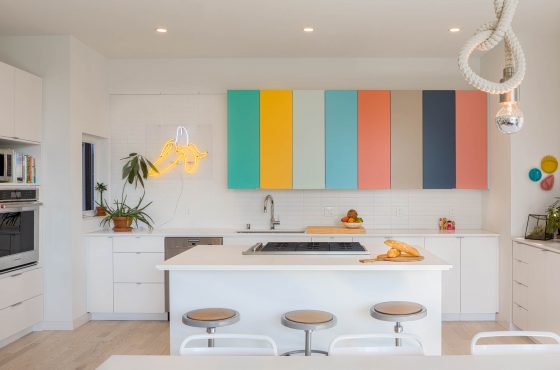
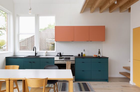
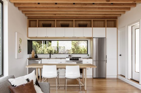
The design started with the kitchen, an important central node to family life. “In Paul’s initial brief, the first thing he mentioned was, ‘The kitchen is the most important space to me,’” remembers Keirsey. “He’ll be in the kitchen, and the family circumambulates around it and lives in that zone.” There, the team removed a wall, bringing in more light and connecting to views of the Olympic Peninsula, then detailed custom cabinetry with recessed reveals and integrated pulls, creating a “design language” with the casework that could be carried throughout the home.
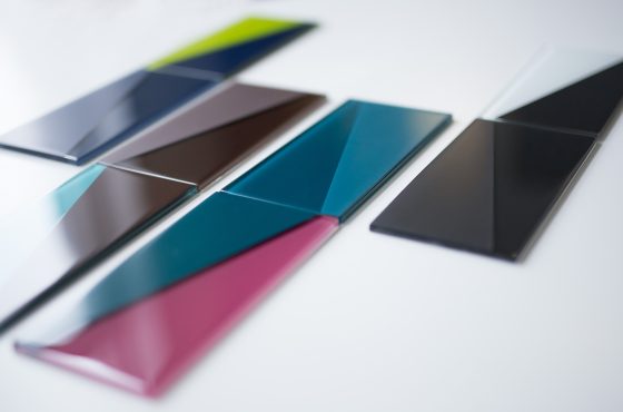
“Our approach was to introduce a language that really amplifies both the horizontal and vertical axes that are running through the whole house,” says Keirsey. White oak blends seamlessly with Bumgardner’s original palette of vertical-grain stained fir and cedar, while additional elements, like the Nero Marquina marble island, a coffee bar, and open shelves against a tiled backdrop, recall the couple’s favorite European coffee shops.
“As much as I would love our house to always look like a magazine layout, the reality is someone’s going to smear something somewhere and leave mail on the counter,” says Kirsten, who asked SHED to keep that in mind. The firm’s attention to detail included showing renderings that had scattered toys and small messes. To aid easy clean-up, they planned thoughtful storage, from the entry hall, to the primary closet, which is so well organized that its door can be left open to the hall. “I still have some empty drawers,” says Kirsten.
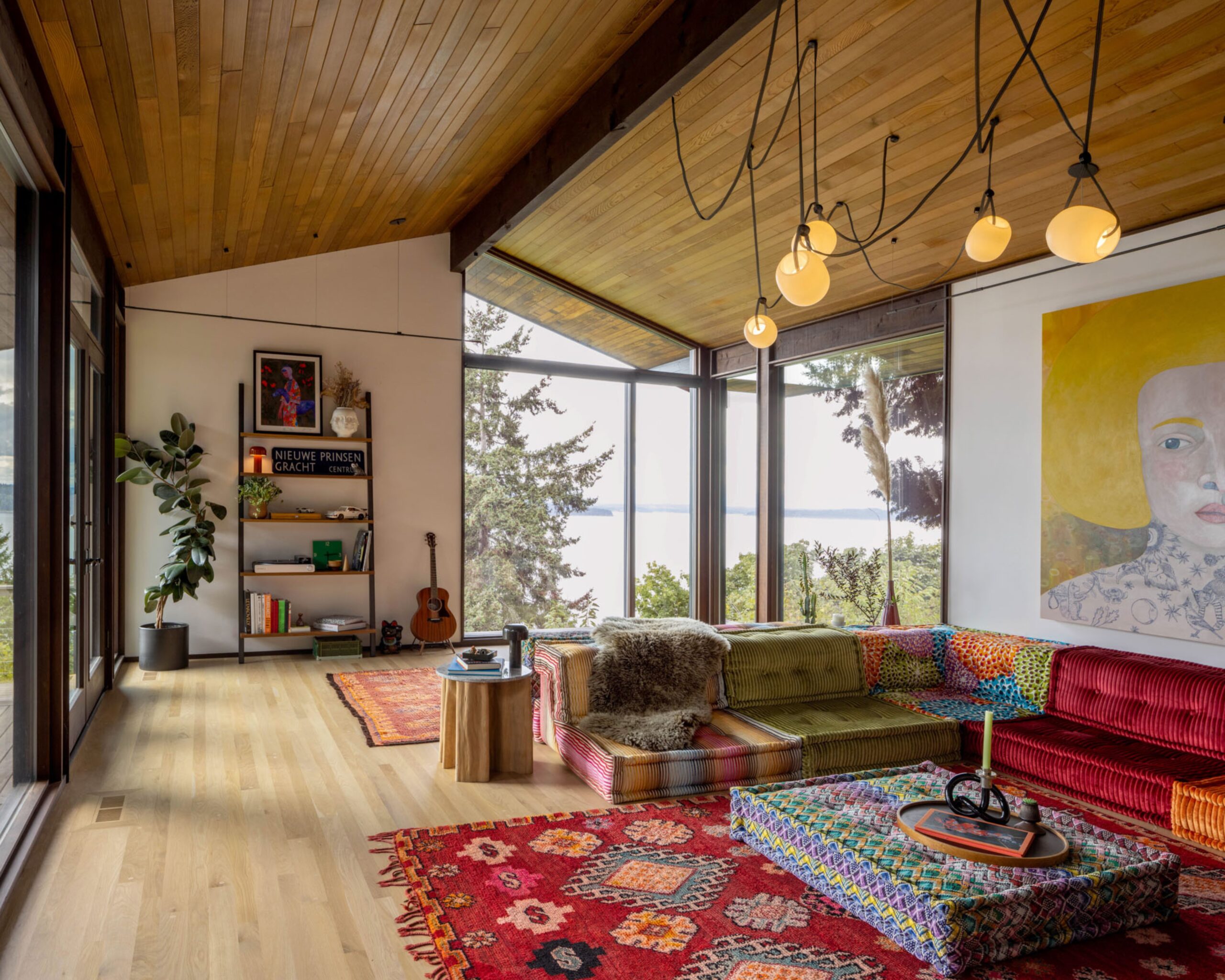
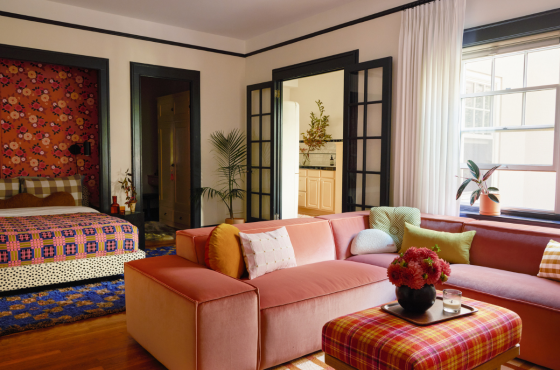
Bathrooms were overhauled to bring in light, increase functionality, and update finishes in line with the rest of the house, while other rooms, like the living room, required a lighter touch. There, the existing fireplace was reworked with a new firebox and tile, closing it off at the back so it no longer reveals the primary bedroom. After Kirsten mentioned the living room needed to be “low,” not unlike a hookah den, the firm delivered drawings that incorporated colorful Roche Bobois Mah Jong couches and a painting by Anne Siems. “They were able to somehow extract the real critical nuggets and come back with their design proposals,” says Paul. “We were like, ‘Wow, it’s like they’re living in our heads.’”
Such creative collaboration between designers, contractor, and client was key to creating a home that, in Goldilocks parlance, has become just right for the family. It’s easy for them to come together in spots, such as the kitchen while Paul is cooking, yet everyone also has their favorite retreats, like Kirsten’s preferred corner in the living room, curled up by the big corner windows. “There were things about the other two houses that made them not feel like home,” says Paul. “But this feels right to us.”
PROJECT SOURCES
ARCHITECT & INTERIOR DESIGN
SHED Architecture & Design
shedbuilt.com
CONTRACTOR
Ambrose Construction
ambroseconstruct.com
CABINETRY
Northwest Custom Interiors
nwcustominteriors.com
PAINT
Benjamin Moore
benjaminmoore.com
